Trying stuff so you don't have to.

State of the Windows: How many layers of UI inconsistencies are in Windows 11?

Hello and happy new year!

It’s 2023, and Windows 11 is finally a mature operating system that most people would be happy to use. Sun Valley has finally arrived, and it’s all about a long overdue reinvestment in design under Panos Panay’s leadership. But is it enough?
Let’s take a look.

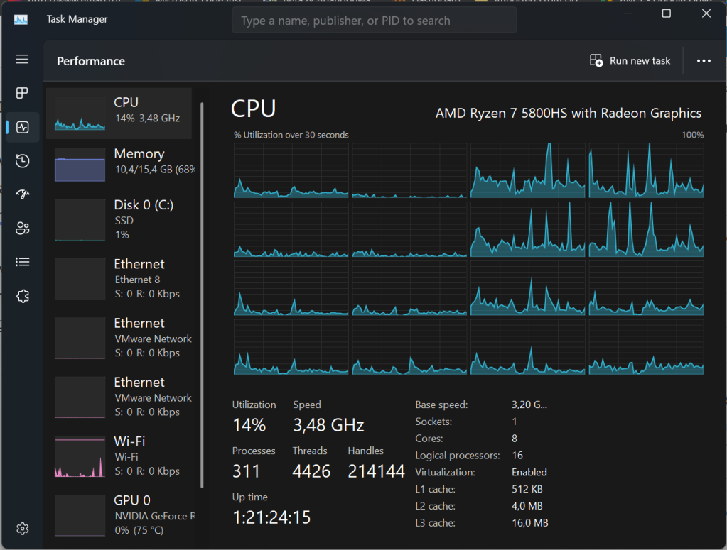
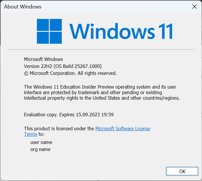
For the purpose of this research, I used Windows 11 build 25267, which as of now is the latest Insider Dev build.

Layer 1: Windows 11/WinUI3 elements

Windows 11 brought in a new design language, putting an emphasis on rounded corners and gradients and a new transparent background called Mica, which aims to replace the old Acrylic design.

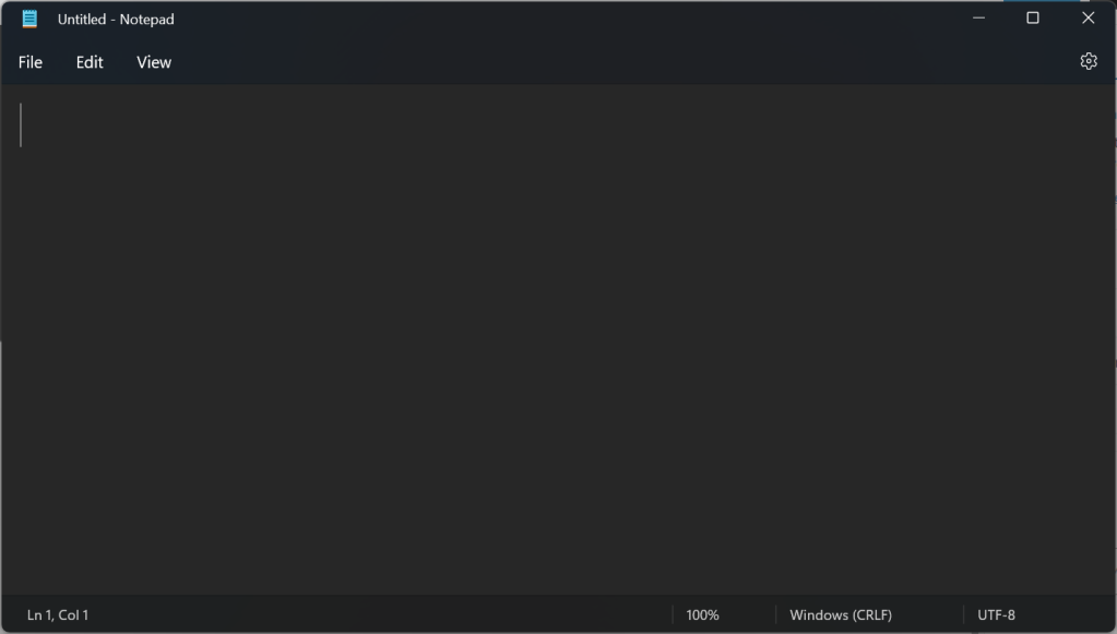
If one would compare Windows 10 applications to Windows 11, it would notice that for the first time in years (decades for some like Notepad), their UI has been significantly redesigned to be in line with the new design language.

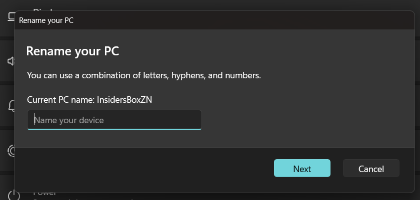
Another fundamental change in Windows 11 is the location of the Start button which, after 27 years, has been moved from the left-hand corner to the center of the screen, in line with the now-cancelled Windows 10X.

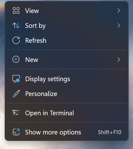
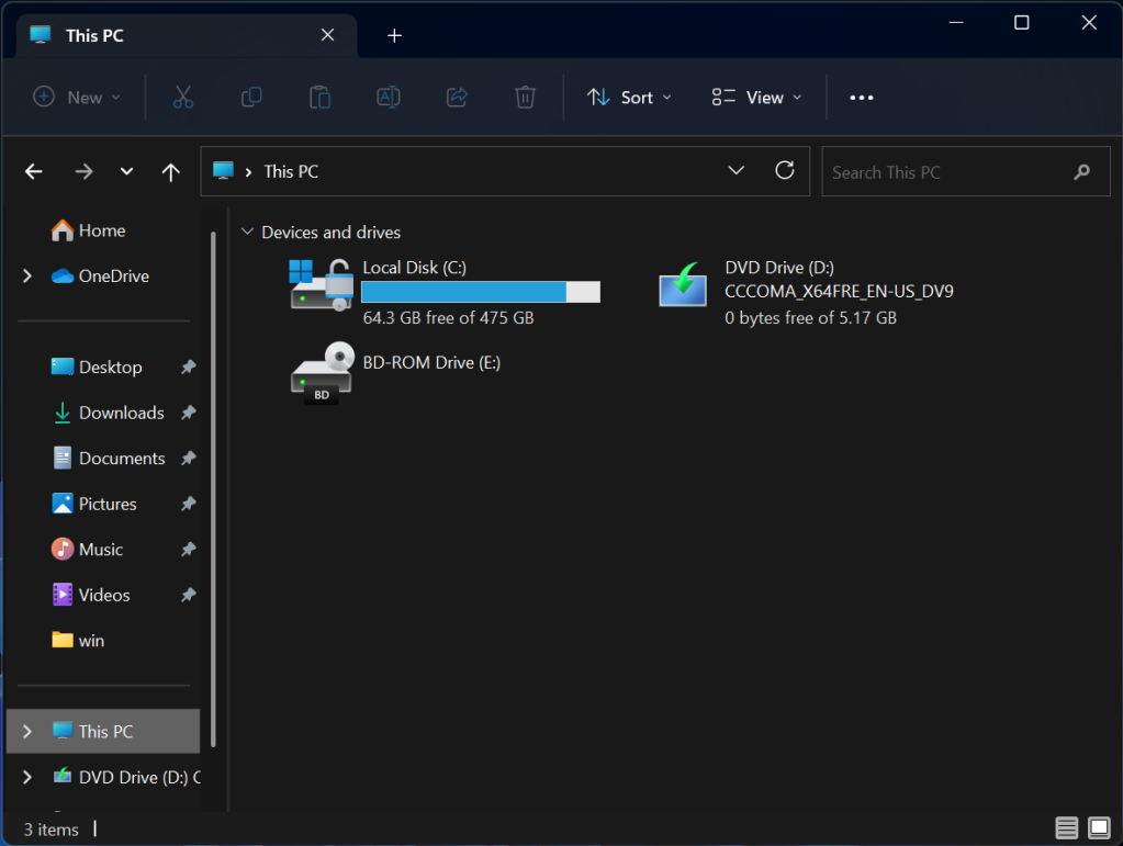
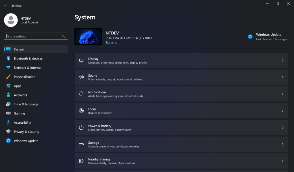
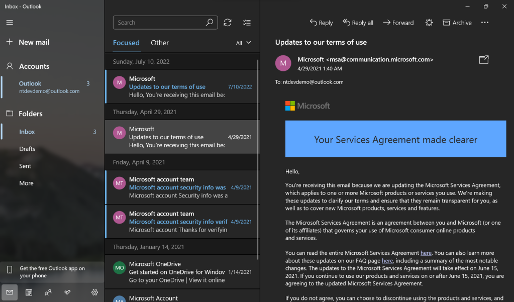
Some elements that have changed compared to Windows 10 are the context menus, the Explorer (which finally has tabs!) and the Settings app.

Last but not least, the Start Menu has been redesigned, and as a result the Live Tiles introduced with Windows 8 are gone, for better or for worse.

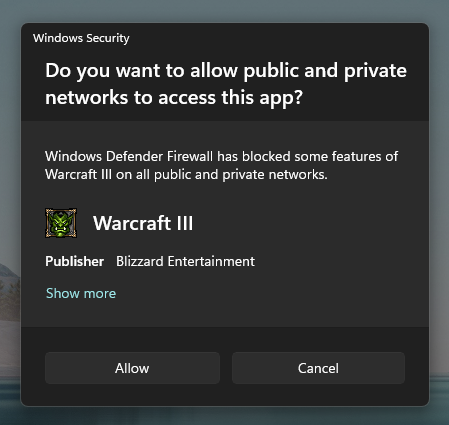
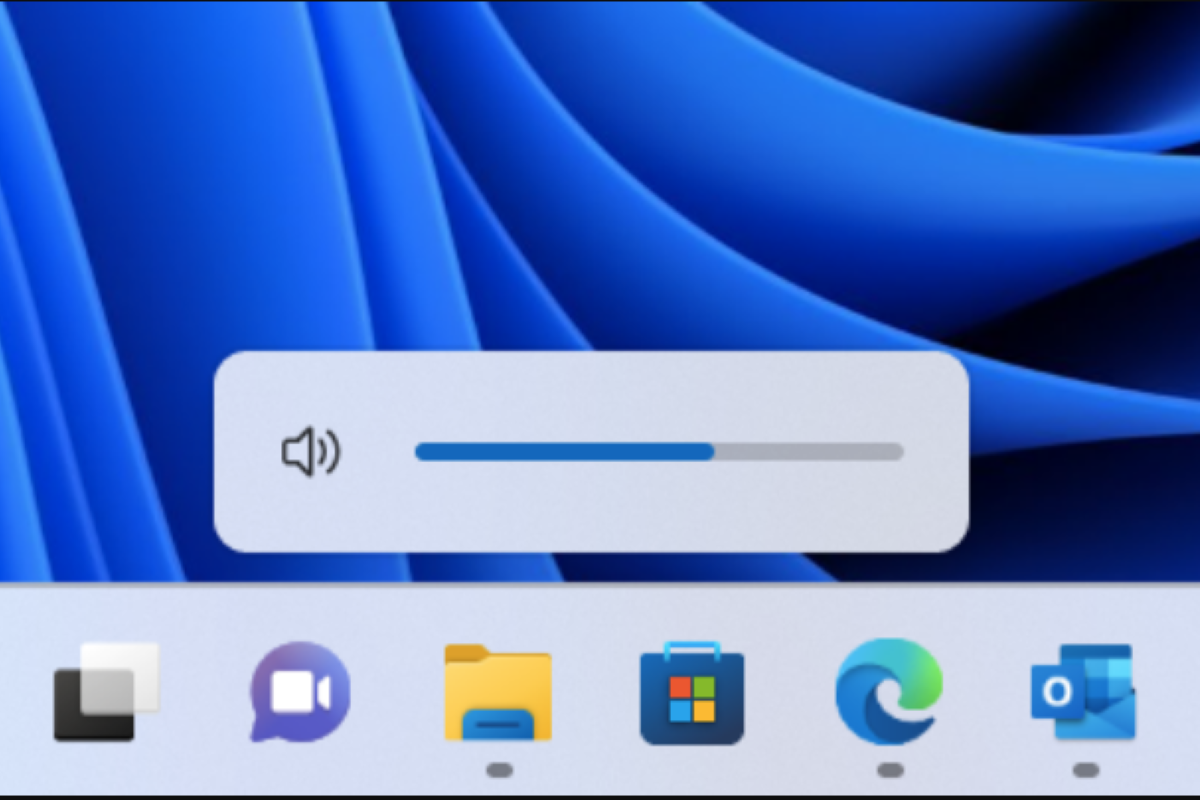
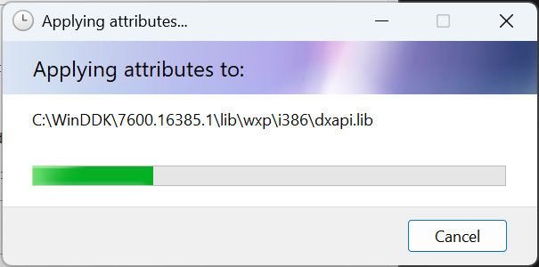
Another great improvement to Windows 11 is the fact that even some elements that are rarely shown to users (especially casual ones) have been updated, like the firewall prompts (which haven’t been updated since Vista!) and many Metro UI (including FINALLY the volume slider) have been replaced.

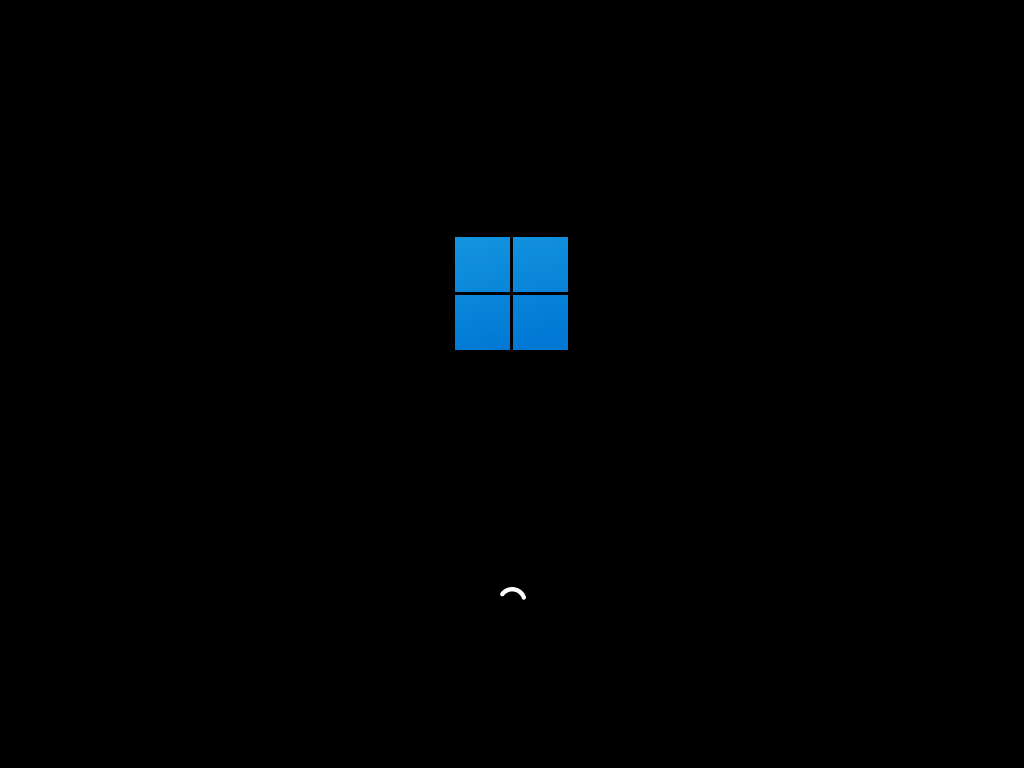
Last, but not least, the boot screen has been updated to the new Windows logo, as well as the new WinUI loading circle, which replaces the dated spinning dots.

As we can see, we definitely see a major improvement in design consistency in Windows 11. Most of the common UI elements have been updates, and with the introduction of WinUI 3 developers can also integrate these elements in their own apps more easily.

Now, let’s dig deeper.

Layer 2: Windows 10 elements

Well, first of all, a non-design element but definitely one that it is common with Windows 10: they have the same kernel version, 10.0

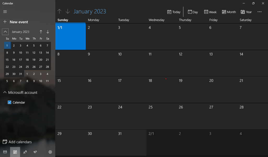
Some apps like Mail and Calendar haven’t been updated with the new Windows 11 design guidelines, but they are reportedly going to be replaced in 2023 with a new application codenamed Project Monarch.

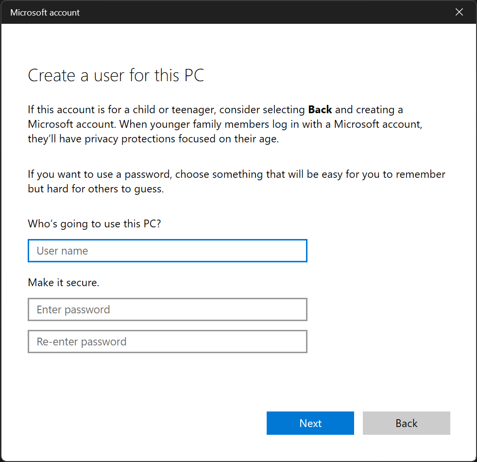
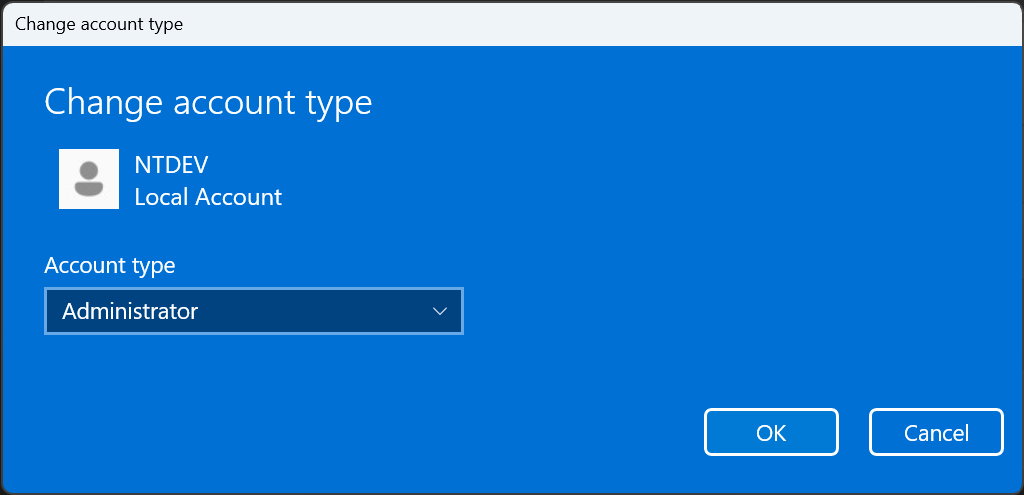
Some Settings elements still haven’t been updated to the new design, like when doing changes to the user profile.

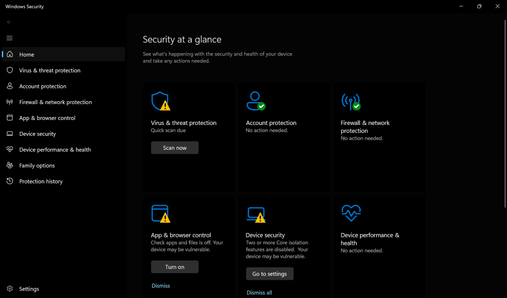
The Windows Defender UI also hasn’t been updated, and as a result it looks considerably more dated than the rest of the UI.

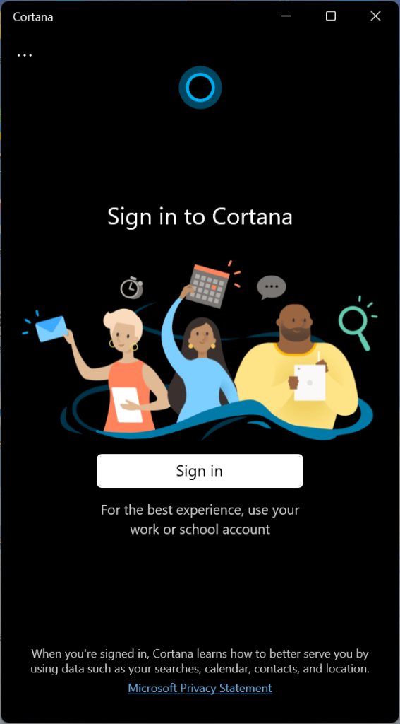
Cortana is also surprisingly still a thing in Windows 11, and it is not as thoroughly integrated with the OS (remember the time when Cortana was guiding you in the OOBE?).

I literally forgot this existed until I found it in the Start Menu.

As we can see, there still are quite a few Windows 10 remains scattered throughout the OS, but these aren’t really eyesores, apart from the Windows Defender app in my opinion, which looks quite off.

Now onto the juicy stuff.

Layer 3: Windows 8

Looks like the curse of Metro is still with us, even though in a few days Microsoft will stop support for Windows 8.1.

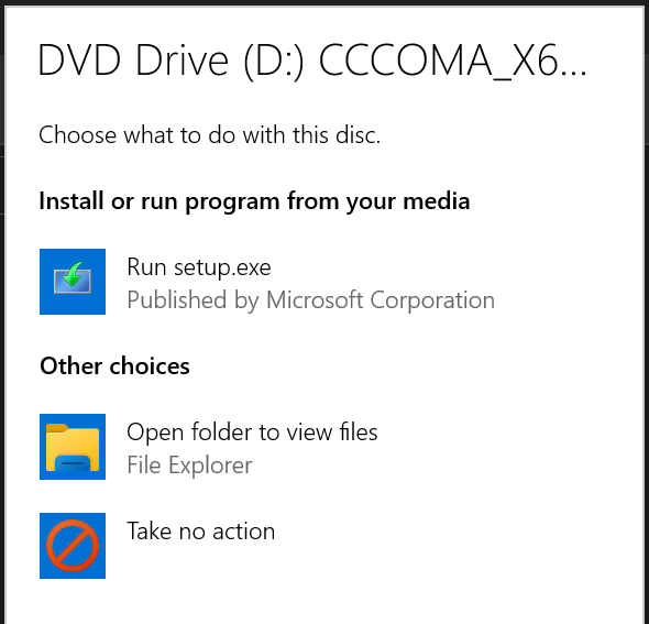
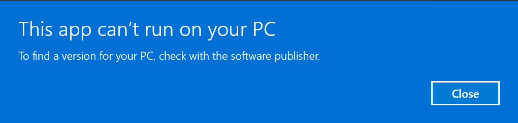
Unfortunately, we still have plenty of Windows 8 elements throughout the OS, like the Autorun prompt or the error that appears when one runs an incompatible program.

These are some of the biggest eyesores of the OS, and it definitely gives Windows a half-baked, inconsistent feeling.

Other elements that are quite an eyesore are the loading screens, which although they have been updated with WinUI3, their Metro counterparts are still prevalent throughout the OS.

Same app, different loading circles.

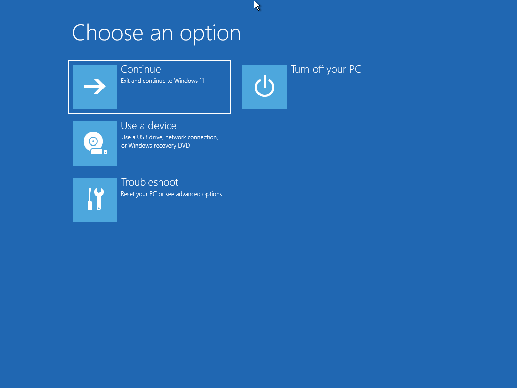
Another Metro element is the Windows Recovery Environment, which looks almost exactly the same as when it was first introduced in Windows 8.

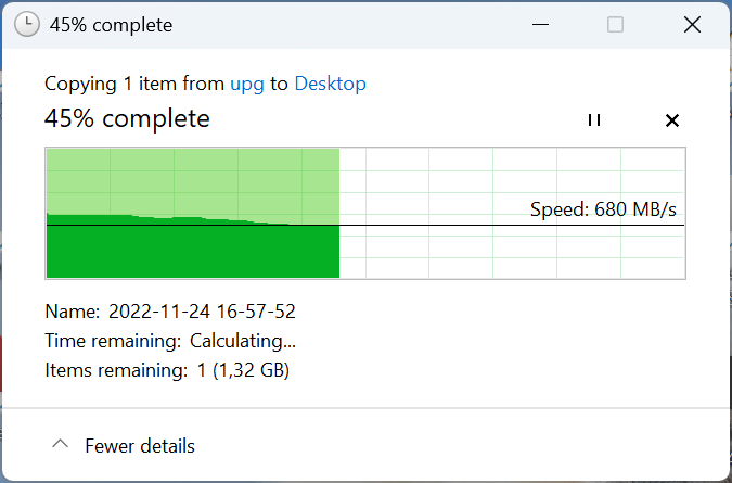
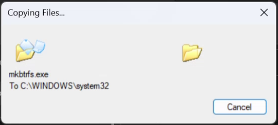
Also, just like in Windows 8, the copy screen is still the same.

All in all, while there has been a notable progress in de-Metro-ifying Windows 11, some important elements are still here.

Layer 4: Windows 7

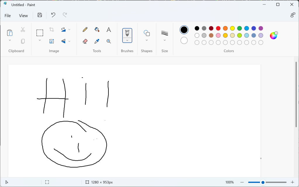
While Windows 10 had most of the inbox apps identical to those from Windows 7, Windows 11 has improved significantly this aspect. Most of the applications like Notepad, Paint, the Snipping Tool and others have been redesigned to be in line with the new design guidelines that Windows 11 proposes. However, since this is Microsoft we’re talking about, some elements haven’t been updated.

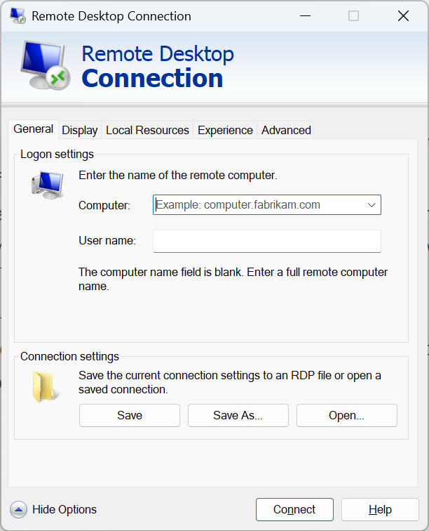
The Remote Desktop Connection program is still exactly the same as it was 14 years ago, complete with Aero icons and skeuomorphic common controls.

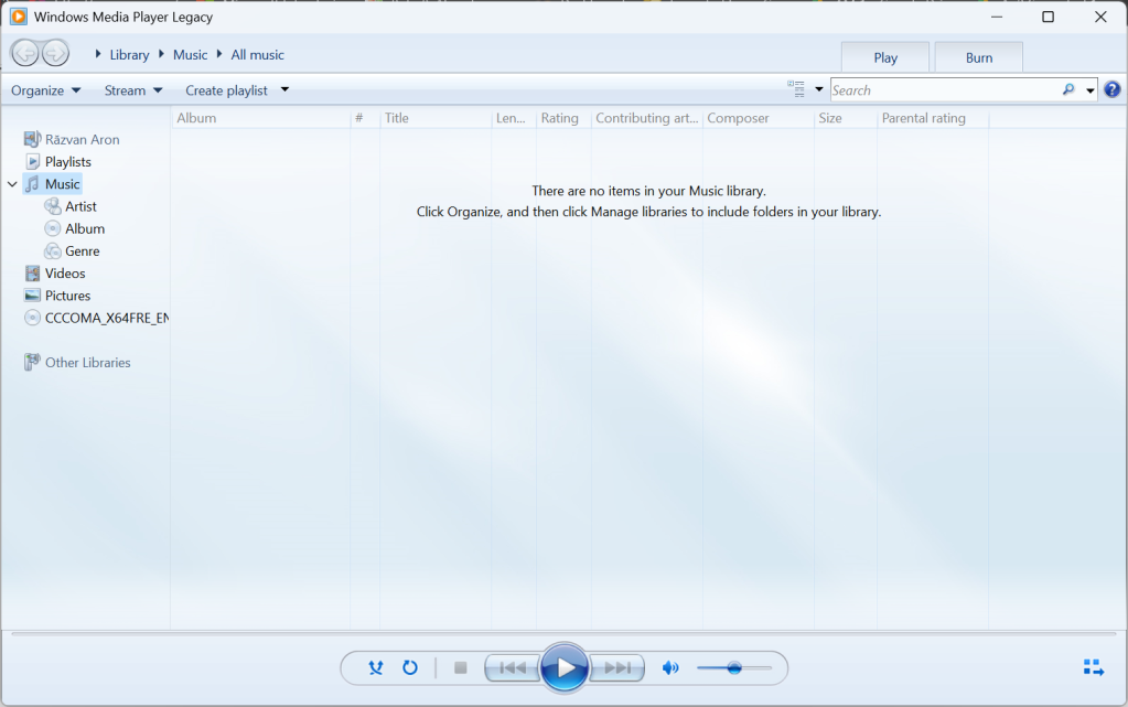
Windows Media Player 12 is also still here, although it has been deprecated in favor of a new Media Player application.

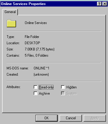
Just like in Windows 10, some file dialogs also have Windows 7 designs.

Onto the fifth layer: Windows Vista

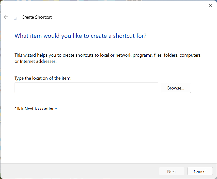
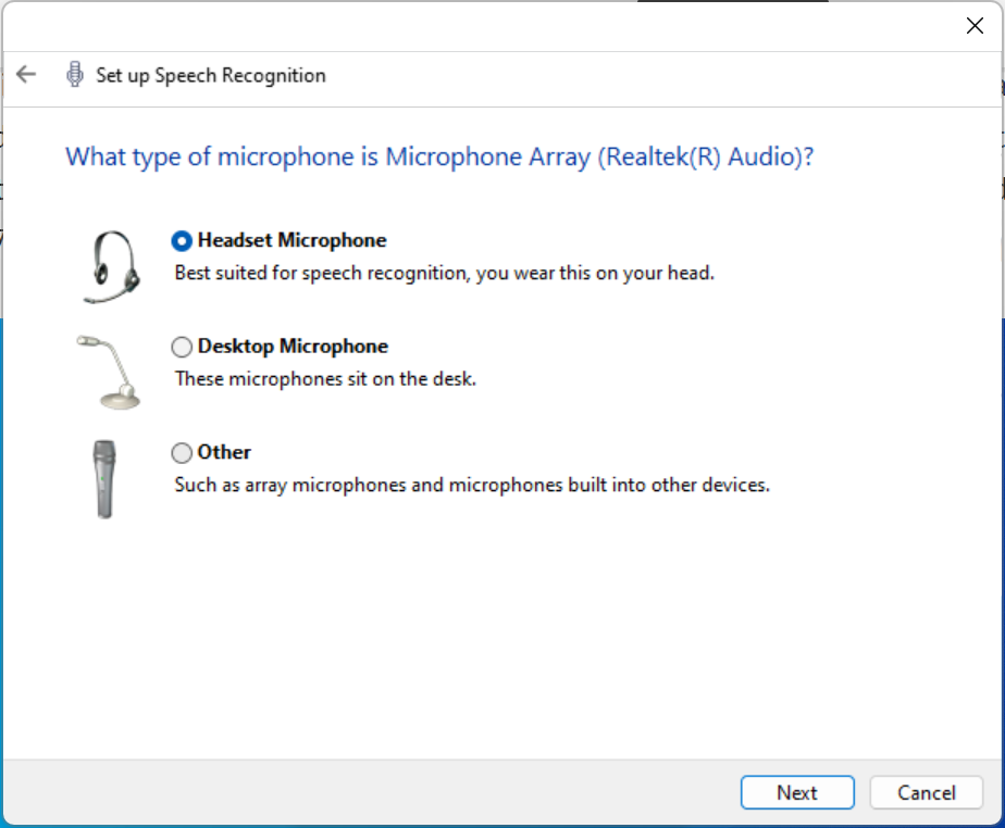
The cornerstone of modern Windows, Vista brought in many new features to the OS. One of these is the introduction of the Aero Wizards, that are still with us in Windows 11 to the same extent as they were in Windows 10.

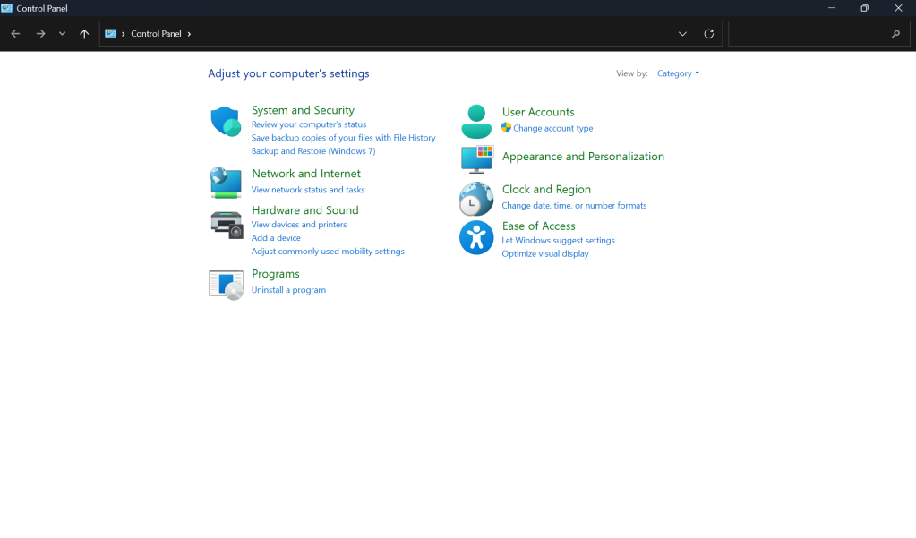
The beloved Control Panel is still here, although most of the common features now redirect to the Settings app.

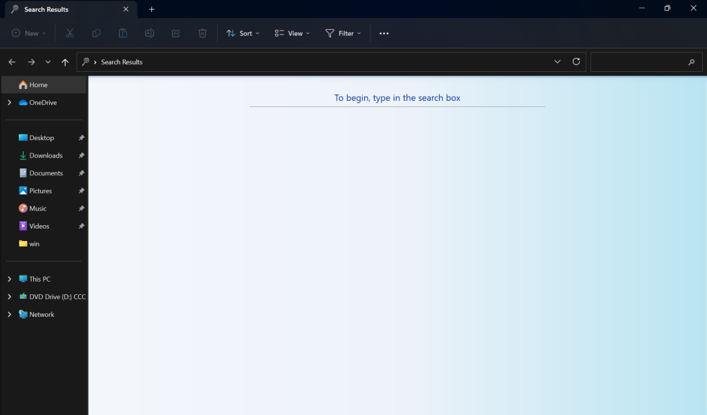
One last Vista oddity is the search program, which looks absolutely lovely when paired with the modern design of the File Explorer.

Gorgeous, right?

Layer 6: Windows XP

Just like with Windows 10, the driver copy screen hasn’t been updated, so it still has the Windows XP icons.

Now, onto layer 7: Windows 2000

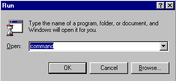
Once again, just like before, things like MMC, winver and the Windows Installer are almost exactly the same, apart from the fact that the Installer had its icons replaced for the first time in 20 years!

What a potpourri of icons.

Now, onto the eight layer: Windows 95/NT 4.0

While the Start Menu has been moved from the far left to the center for the first time, everything else is still the same.

Just like in Windows 10, elements like the folder options, the mouse settings and many other UI elements have stayed basically the same for the last 27 years.

And finally, layer 9: Windows 3.1

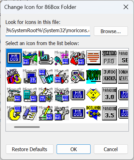
The ability to choose icons that are more than 30 years old is still here, with the inclusion of the very important and absolutely critical to the good function of the OS moricons.dll

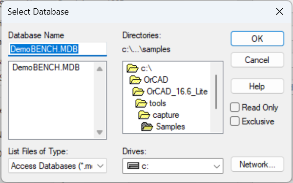
And last, but certainly not least, in the ODBC Data Sources utility there is a Windows 3.1-styled folder selection window!

Conclusion

As we can see, while there are definite improvements in Windows 11’s design consistency, they are somewhat superficial (but still more thorough than those that were introduced with Windows 10), and there still is plenty of room for improvement. However, compared to Windows 10, at least most of the “casual” UI is somewhat consistent.

In 2023 Windows 11 will reportedly get 3 of the new “moment” updates, which are supposed to bring in new features and UI fixes. Not only that, but Microsoft is thought to be working on decoupling the UI elements from the rest of the OS even further, so we should probably see more improvements more quickly.

Thank you for your attention.

60 responses to “State of the Windows: How many layers of UI inconsistencies are in Windows 11?”

  1. I can’t see Never Combine. Windows is unusable without this.

    Liked by 3 people

    1. Completely agree. Was the first thing I tried to “fix”. Super sad I “upgraded”. Blah

      Like

    2. If you mean the taskbar buttons, 100% agree.

      Fortunately, there are various options (free and non-free) that return the taskbar/start menu to its Windows 7/10 level of usefulness.

      Personally I use Start11, which is well worth a fiver to get “never combine” back!

      Like

    3. Multi-trillion dollar company we’re talking about here. Quite embarrassing for them when Linux distros are able to have consistent UI’s throughout the OS with unpaid volunteers working on them.

      Like

  2. It is terrible what is delivered here at a ui, thx for your blog post about this

    Like

  3. […] Wer mehr Bilder im Vergleich sehen möchte: ntdotdev.wordpress.com […]

    Like

  4. Good insight into how fragmented Windows UI has been since forever. Thank you for this

    Like

  5. What a sad article! The author does not seem to have the faintest clue what a user interface is for so I’ll tell them. A user interface is the means by which we communicate to a computer what we want to do. It is not for looking at and waxing all arty farty about!
    I don’t care if buttons have round corners or graduated fills. I just want them to be ergonomically positioned – preferably exactly where they were last time so that I don’t have to hunt around for them. Imagine what it would be like if you got in your car and when you needed to stop you found that some moron had moved the brake pedal to under the back seat because they thought it looked better there!
    And as for wanting to live back in the days of CRT monitors that could only provide white text on a black background (verified by psychologist to be less readable) give me a break and leave fashion out of user interfaces!

    Liked by 2 people

    1. You can do all of this without making the whole user experience look like a mishmash of parts.
      I wasn’t even critical (actually in the end I acknowledged Microsoft’s efforts to improve on the aspect of consistency), I was just stating facts!

      Liked by 3 people

      1. Yes, you were stating facts. But your implication in tone is that the inconsistencies are inherently inferior. Consider the impact of resolving those items with the ingrained (over decades) user experience. Sometimes it is best not to fix that which is not broken. And then again, sometimes it is.

        Like

    2. Psychologist? Which psychologist decided to do research in Color Theory? The reason why white text on black background is generally considered less readable is due to astigmatism which has nothing to do with psychology either.

      Also, you’re entirely ignoring that that same field of science also indicates that consistent behavior and visual queues is equally important, if not more.

      What a sad comment you wrote.

      Like

    3. Thank you, fashion has NO PLACE in a computer UI, other than function. It’s like the inmates are running the asylum, down at Microsoft.

      Like

      1. This doesn’t necessarily mean that everything has to look like a mix of completely different paradigms and abandoned parts, I think.

        Like

      2. I use windows to run industrial robots, all I care about is ease of access of controls. There is already an os that is centered directly on fashion, made by Apple. I am ok, with function over all, so unix, linux and w3.1-w10 are just fine by me. WXP and W7 ui’s were efficient, and w8.1 w10 were usable with ui tweaks, even w11 is usable with ui tweaks, but the harder Microsoft tries to become a fashion house instead of an engineering company, the worse their ui gets. IMO

        Like

    4. I agree. Fashion has NO PLACE in a ui. Only functionality is important. It’s like the inmates are running the asylum down at Microsoft.

      Like

      1. You seem to have missed the last 4 decades where computers stopped being the preserve of self-centred nerds (of which I count myself as one) and became consumer appliances that need to work for (and be operated by) normal people.
        You also don’t appear to be able to see past your misunderstanding of aesthetics. The way you categorise things as either ‘fashion’ or ‘engineering’ is telling. Design and Technology do not need to be mutually exclusive, nor is one inherently more valuable or worthy than the other. You could have the best engineering on the planet, but if your interface makes people reach for the eye bleach and they don’t use your product, then what’s the point?

        Like

    5. missingxtension avatar
      missingxtension

      I completely agree! UI was perfected around the xp days, yet the minimalist movement became fashionable, and fashion now continues to bend the UI into non usable garbage. Drill down menus are a very important and useful element that cant be removed, but gets showed into tabs and ribbons. Its like what streamlining did to industrial design with toasters. I blame Apple, there was nothing wrong with the ctrl+esc, u, u, enter to shut down. Then there was ctrl+esc, u, r, enter to restart or all the shortcuts windows bombed into oblivion when the scrolling taskbar got introduced. I dont care what app it was, I could get to it with simple keystrokes within 1-2 seconds. This all changed because Apple forces its users to use a mouse and bragged about its (faulty) spotlight that was actually going to be a microsoft feature that came too late. Windows 10 came with no improvements in the UI for anything, the live tiles that actually provided useful information are being phased out. Now we have a useless star menu in the center…Why?? its most useful horizontal on the left or right, most screens are wider and thanks to mobile phones most apps and websites don’t use any of those pixels. Perfect place to park the taskbar, make it wide, now shows a list of apps and has room for 2 sets of icons on the notifications tray while showing the full date and time.

      Liked by 1 person

      1. Now it’s Win + X, u, u. Same thing, just made it slightly easier to use and in line with all the other Windows shortcuts. Alt + F4 also works when no application is in focus. As for everything else, yes, they seem to take away functionality with changes.

        Like

    6. Totally agree fashion has no say in a UI. I’ve been involved with computers ( mainly programming ) since the mainframe days so I’ve witnessed/endured all flavours of Windoze on pc. In my opinion 98 was the first *proper* Windows followed by XP – several abortions followed until Win 7 appeared which I think is the best so far. Computers are not toys or fashion statements to me they are a tool and the less intrusive the UI is the better. The end user shouldn’t even be aware of the OS unless they have a problem or they are installing updates.

      Like

    7. What a sad comment! The author does not seem to have the faintest clue what design is for so I’ll tell them. Design isn’t arty farty round corners or graduated fills. Design isn’t how it looks, design is how it works.
      Snark aside, the main reason stuff like this is important is that it betrays a lack of polish, a lack of attention to detail. It betrays a lack of care, a perennial Microsoft problem. If the interface hasn’t had enough thought given to actually bother updating it to be consistent with the other elements around it, what else haven’t they given a toss about?
      Of course the UI should be ergonomic, and intuitive. It should also be *consistent*. Good communication depends on such things.

      Like

    8. Except when a user can’t rely on what a UI will look like or how things are layed out, you’ve failed at designing a UI. Consistency matters; I don’t want to have to Google how to do basic tasks like adding a network share on Windows because Microsoft can’t be arsed to create consistent design patterns across their OS.

      Like

  6. […] NTDEV strips away the sedimentary layers of decades of technical debt and half-baked UI fads: "How many layers of UI inconsistencies are in Windows 11?" […]

    Like

  7. I am always amazed what talented professionals can see over us ordinary people. What a mind-blowing article!! Thank you for sharing your impressive mind and work!

    Liked by 1 person

  8. NazgulSenpai avatar

    Great, informative article!

    Also I’m not sure what Dexter is on about. Seems way too offended by your article pointing out things that anyone can verify are accurate…

    Liked by 1 person

  9. And… It still looks like s&&t compared to windows 7. It’s functionality is even worse, where you often have to call up old control panels to actually get things done as the new ones lack controls you need.

    Liked by 1 person

    1. Windows 11 ui looks like it you mixed an os and a lobotomy.

      Like

    2. Windows 11 looks good to me

      Liked by 1 person

  10. Brain is also required avatar
    Brain is also required

    GUI consistency was always retarded, take it literal. Why force your thoughts onto other people on the other side of the globe? What the american might hate, might be perfect in the eye of the russian.

    Stunts development as well, as you have to cater for people like you. Time leeches. Complain, complain, complain, whaa whaaa.

    You aren’t even consistent yourself: Whose domain are these thoughts from? Yours? Or wordpress.

    Like

    1. Oh poor little Microsoft and their 1.8 trillion dollar market cap. As I replied to another similarly salty comment, I was just stating facts, which doesn’t necessarily mean that I’m complaining.
      Also, the .wordpress.com domain is due to the fact that I’m using a free account. I’m not affiliated with WordPress in any way.
      Have a nice day!

      Liked by 2 people

      1. Douglas Englebart avatar
        Douglas Englebart

        Don’t mind the salty MSFT Devs posting here that contributed to this clusterf*ck abomination of UI/UX hell that is Windows NT – 11 all frankensteined together to justify their low comp compared to real FAANG companies. The Windows experience has always been beyond frustrating and death by a million UI-dark patterned paper cuts.

        Liked by 1 person

  11. […] It’s 2023, and Windows 11 is finally a mature operating system that most people would be happy to use. Sun Valley has finally arrived, and it’s all about a long overdue reinvestment in design under Panos Panay’s leadership. But is it enough? Let’s take a look. […]

    Like

  12. To be honest… I didn’t installed Win8 and Vista because they were different. My path was 95-98-XP-7-11. Even now im a bit lost when i need to look for changing some Environment Variables. Luckily there is a search bar i’ve learn to use. All in all i would say that improving is good, total reorganization is a bummer. Unless there is a need for it for security / ergonomic reasons. Someone said something about cars – that’s exactly the perfect analogy. Leave the pedals where everyone knows they are. Just my 2cents

    Liked by 1 person

  13. […] alla ricerca delle principali elementi incoerenti di Windows 11 si trovano addirittura nove livelli di scelte di design differenti che ci portano indietro nel […]

    Like

  14. I don’t understand some of the comments here.

    There’s no benefit from having such inconsistencies across the OS. Different UIs, different control panels, lack of support for dark theme, etc. Yes, I agree that stability and usability comes first, but that’s not incompatible with things looking and behaving the same across the whole system.

    I’m not even talking about the new UI, if it’s better or not. I simply don’t understand why would anyone defend this mess. How are settings page that are missing options or don’t adapt to a dark theme a good thing? What’s the benefit of having a dialog window that looks like Win 2000?

    Anyway… thanks for pointing these inconsistencies. Microsoft should do better.

    Like

    1. missingxtension avatar
      missingxtension

      Not defending this mess at all. It’s actually there because of how amazing legacy is supported within windows. I wouldn’t even really expect Linux to support sometimes 1 year old software, dependency break way too much software. A lot of times when one dependency gets updated it breaks software, I haven’t found a way to keep old versions with newer.
      I wish they would have just put a fresh coat and left UI intact. The automotive analogy is like Toyota releasing a 2019 tundra which is just a revised 07, suspension is the same, etc, just the interior and body panels get a lift job. Therefore changing the overall design in a negative j squarish jaring lines to a design that was originally bubbly and curved.

      Like

      1. That’s ironic when there are win98 games like TOCA 2 which run on modern Linux through wine but not on modern Windows.

        What programs exactly have dependency breakage after only a single year? Are you updating packages manually and ignoring your OS’ package manager?

        Like

  15. Darn, I would miss moricons, if Microsoft would decide to remove them. I was there, kid!

    Like

  16. Fabricio Lima avatar
    Fabricio Lima

    I use to complain about this all the time. Based on the comments, perhaps this don’t upset all user base.
    We all agree with Doug that the UI should be the interface between machine and humans, also, surely let’s not change the brake pedal to back seat (as they are doing with AC controls that now are touch and disrupt the experience!).
    Doug’s point is valid for the Screen Saver or Run dialog where, it works perfectly, thus it shouldn’t be changed, but the key point in this article is that its UI should match the new interface. When we are at the Settings app, and select screen saver it brings the old UI, this is cumbersome. Something is wrong for sure (and the effort to fix this is minimal – should be!).
    Like the ODBC folder selection, as it’s a legacy feature which “nobody uses it”, they don’t prioritize it.

    Liked by 1 person

  17. […] por voluntários (Gnome, KDE Plasma, Xfce), apresenta inconsistências visuais do tipo. Via NTDEV (em […]

    Like

  18. Totally human avatar
    Totally human

    Fun fact:in some builds/version of windows 11 you can still make picture password from windows 8! (yeah idk why microsoft still want to included anymore)

    Liked by 1 person

  19. Having the UI be consistent is also a part of usability, don’t forget. Especially with some of the newer elements from 8.1 and later, they function / link to other screens quite differently to the older ones.

    Since we love car analogies so much, it’s like the accelerator pedal functioning when you push on it, but the brake pedal needing to be pulled on instead. It creates confusion, especially for people who haven’t spent the last 20+ years of their professional life learning it all.

    Like

  20. […] How many layers of UI inconsistencies are in Windows 11? 550 by crecker | 402 comments on Hacker News. […]

    Like

  21. […] How many layers of UI inconsistencies are in Windows 11? 551 by crecker | 403 comments . […]

    Like

  22. […] How many layers of UI inconsistencies are in Windows 11? 551 by crecker | 403 comments on Hacker News. […]

    Like

  23. Dear NTDEV, I really appreciate your articles on this topic. My opinion is that Microsoft is very committed on this UI renewal topic, but they never complete an update cycle, because they propose a new UI style, and so everything starts again without finishing the old work.

    Like

    1. But why does finishing an update cycle take *so* damn long? On the GNOME side of things, libadwaita had only been out for a little over a year and practically everything has already been moved over to it – and that’s with mostly volunteers working on it! How is one of the biggest companies ever with infinitely more resources and with billions of users not able to keep up? It’s ridiculous.

      Like

      1. I suppose the main reason is not time or man power, but the the fear by Microsoft of “breaking” something used in corporates’ environments. I’ve seen in the past a lot of not-so-smart-people panicking because the Start menu is now an icon and not a button with Start as label. I don’t have any other explainations! Instead on Linux and MacOS I’ve seen a lot of changes without people complaining, and maybe they can go faster in changing everything. (I prefer this last way of doing 😉 ).

        Like

  24. Not everyone uses Windows exclusively to work with robots and some people do appreciate the shiny buttons and icons, you know, regular people who don’t work with computers all day.

    Like

  25. My biggest gripe is how the new settings UIs keep being implemented and the old ones hidden, without the new ones having anything but either view-only or extremely rudimentary access to those settings.

    Particularly, this is most painful with networks and printers. Control panel or powershell is necessary to do anything meaningful with either of those. And there’s no excuse. We are talking about simple UIs that change simple registry settings, for the most part.

    There’s NO REASON Win 10 and 11 shouldn’t have complete UIs for at least the network settings, without forcing you to use the win 7 network & sharing center or the original network control panel. And there’s no excuse for it. Win 10 has been out for what – almost 8 years, now?

    Liked by 1 person

  26. Since Windows 10 release Microsoft has become so ADHD with projects and features that nothing is completed before moving to the next. There is so much indecision at Microsoft with the direction and look of Windows, as a result we have a Frankenstein of a O/S. I have little hope of things improving even now they have gone back to the 3 year release schedule, considering all the “moments releases” they have already announced for the first three months of 2023 alone.

    Like

  27. […] was amused to read “State of the Windows: How Many Layers of UI Inconsistencies Are in Windows 11?” We have Windows 11 running on one computer in my office. The others are a lone Windows 7, four […]

    Like

  28. […] love it when people make fun of Windows’ many inconsistent layers of UI styles because each time there’s one new layer! How […]

    Like

  29. Moving the start button is not a fundamental change: removing it would be. I see the registry is still around!

    Like

  30. […] all about a long overdue reinvestment in design under Panos Panay’s leadership. But is it enough? Let’s take a look.For the purpose of this research, I used Windows 11 build 25267, which as of now is the latest […]

    Like

  31. I can’t stand people complaining about “design inconsistencies” when changes remove features. Even the changes that have been made on many things have not taken away an eyesore but made things less intuitive to do or just removed features. Many of these things are “haven’t been updated” aren’t things to be updated. What does he expect? He shows the old and new of a couple screens, and they have even been updated. As for things that possibly are from old system, leave them! That’s the nostalgia of back when you were using computers back then and also of when there were more features and options in many ways.

    Like

    1. I’m not an advocate of updating things just for the sake of it. However, having a consistent design DOES NOT mean that you have to remove features. Just because Microsoft does this does not mean that it’s normal.
      What I’m saying is, having a consistent icon and design language is honestly not that hard. You can take a look at rectify11, a project made by enthusiasts on how design consistency can be achieved without breaking things or removing features.

      Like

  32. If Windows still makes lots of money for Microsoft, they will definitely spend people & money to improve the details.

    Like

Leave a comment

Blog at WordPress.com.